In Service Of The Vision Which Captures Us
In graphic design...it's easy to just make pretty stuff.
But...to brand your products and license it successfully? You'll need a lot more than just "pretty".
You'll want a experienced design team with foresight - and an uncanny perceptive mind and a knack for putting massive, chaotic information into visual order.
If you don't - as we've too often witnessed - your efforts to market, brand and license your product will likely end in disaster - lost in a sea of endless organizational nightmare and visual design mess - thus driving buyers and investors away.
Fortunately for our clients...our capabilities reaches far beyond just making their stuff look nice...
We develop visual systems of branding, packaging and presentations that's both engaging and well-thoughtout.
(Click on each image below for a larger view.)

We helped visually upgrade the business card design of a local event-management business by giving it a organized, modern yet subtly glamorous feel.

Condensing massive information in a clear, concise and friendly manner is another hallmark of our corporate designs.

This shows the interior of the folder, consisting both the insert information pages and a information table tent.

This project is inspired by recent trends that bowling has started to be identified as an old fashion sport for younger people.

A faned open swatch book for Disney Branding. This design brilliantly organizes complicated Disney licensee guidelines into a single, easy to use reference source.

Different versions of the Specifier reflects a singular, unified visual system.

All licensee color expectations are displayed in a easy to follow, organized manner.

Clean, sleek yet engaging are the hallmark of Spices+Colors' design.
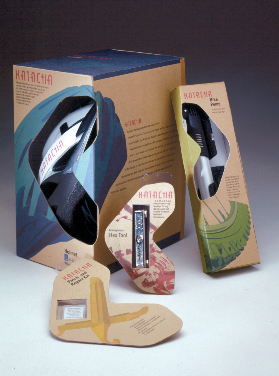
The goal is to create a packaging system that conveys movement & bicycle's rhythmic locomotion.

The goal of this project is to give bowling a new look and feel - to reach a variety of young audiences.

Every accessory packaging, from air pumps to tools, reflects the same "Arrow theme" that strongly suggests "movement and direction".

Created for Disney Consumer Products Human Resources, this packet aims to evoke a sense of joy, professionalism and warmth to the newly hired.

A church cafe - this logo aims to represent a sense of "let's have a good time" in a positive, Christian environment.

Faith Community Church's Cafe DeFé. This is how the logo is applied to the cafe's storefront menu.

A personal design for my own wedding invitation, This invitation is based on oneness and unity. The ribbon in the front with a knot symbolizes two tying together become one knot.